Exciting news: Brizo FoodMetrics has been acquired by Datassential! Learn more.

Website as Digital Storefront
Darcy Kurtz, the Chief Marketing Officer at BentoBox, the restaurant website platform, says, “Now, more than ever, independent restaurant operators understand the importance of having a website they can control and use to drive revenue,” she says. “The website is the restaurant’s digital storefront, the one place online where owners can communicate with their customers and grow off-premise revenue streams,” Kurtz notes. These streams include gift cards and merchandise.
Online Ordering
According to Brizo data, 382,307, or 57% of restaurants in North America with verified websites offered online ordering. A small percentage — 9% — lack online ordering capabilities, but that number may soon shrink even further. Kurtz says, “Owners recognize that online ordering is a lifeline.” Bill Fow, Director of Web Development, at Aspire Digital Solutions, a digital marketing and web design agency located in Ridgefield, Connecticut, concurs. “There was a tremendous influx of restaurants with a need for online ordering — even from those who had been resistant to it,” Fow says.

Image: Restaurants in North America with verified websites and use online ordering systems.
Additional data point: In total, 57% of restaurants in North America have verified websites and are also using online ordering systems.
Emphasis on Imagery
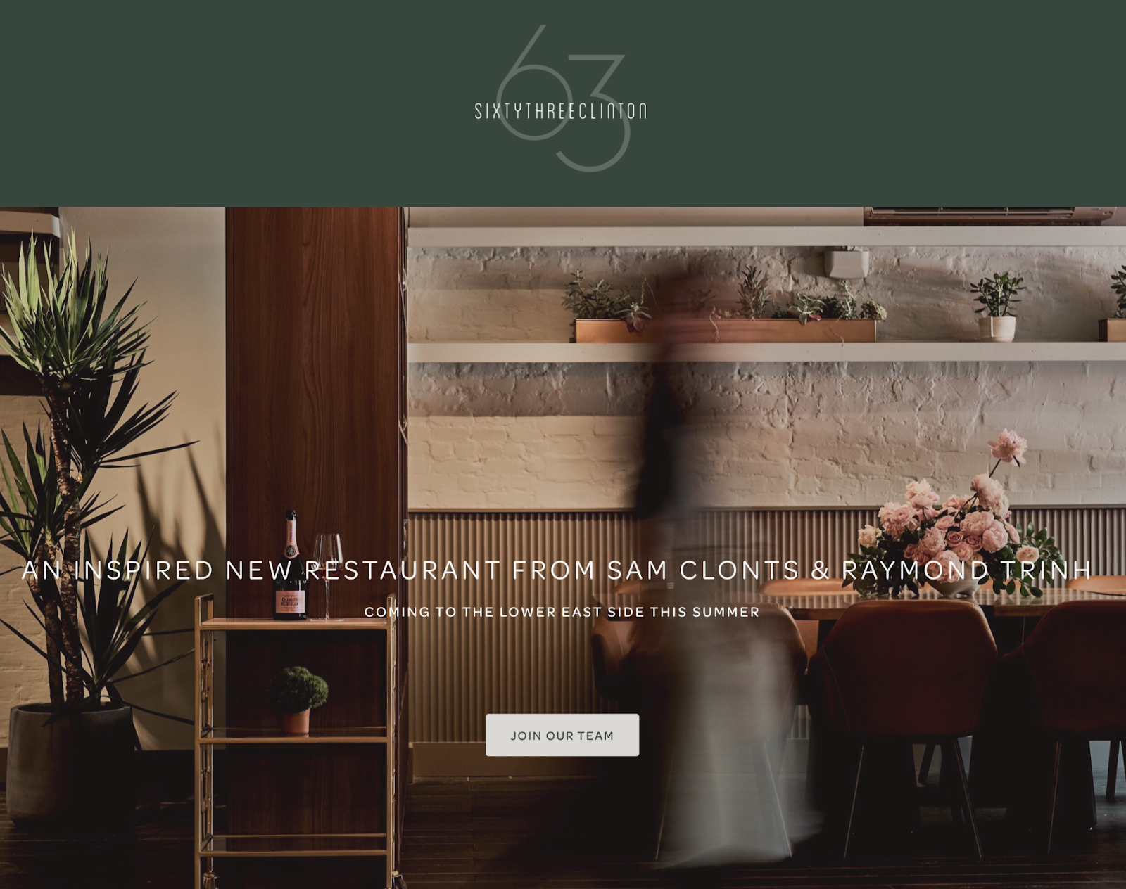
Kurtz says, “The adage that ‘people eat with their eyes’ is especially true in this digital-first world and that universal agreement has increased over the last few years.” Carla Siegel, the founder of Agentsie Hospitality Design, a New York City-based firm that provides a wide range of design and communications services for the industry, agrees. “People’s first impressions happen so quickly, so it’s really important to have professional photography,” Siegel says. “It’s difficult to make a stunning website that people want to stay on without great photographs,” states Fow. His team even employs 360-photography to allow diners to experience the space. ”People can click and drag on them for an interactive experience,” he adds.
Bold Colors — or One Color
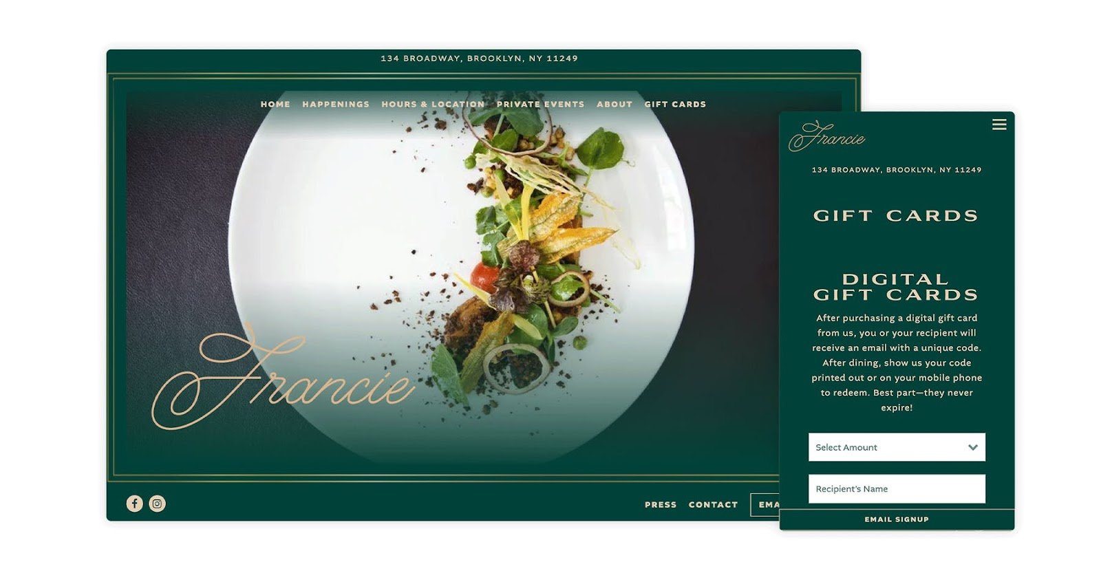
“From a design perspective, we are seeing bold and vibrant colors, unique textures and backgrounds, and creative fonts and typography,” says Kurtz. “People are leaning into very rich tones — lots of dark greens and deep reds,” Siegel states. Conversely, says Kurtz, “We’re also seeing restaurants lean into clean, simple, and minimalistic websites with an easy to navigate UX that captures the guests’ attention and keeps them engaged on the website for longer periods of time. Lastly, we’re seeing an abundance of monochromic websites.”

Photo courtesy of Francie.
ADA Compliance
The Americans with Disabilities Act extends to the web, even though its passage precedes the explosion of the internet. (You can read more about it here.) Designers are now being tasked by mindful clients with making sure websites are ADA-compliant. Siegel says, “There’s this whole movement happening to make sure that people with low vision or no vision are not being excluded from the web experience.” Fow notes, “I think some of the reasons we’re seeing people employ these big color contrasts is for ADA-compliance purposes. It’s very important to make sure that everything is legible and readable, especially if you have people who are color blind or using a screen reader.”
Speed and Mobile Optimization
“Almost 60% of customers visit a restaurant website from their mobile devices. It’s extremely important that a restaurant’s website is responsive to different devices and loads quickly regardless of connectivity. A poor mobile experience leads to lost customers and ultimately less revenue,” Kurtz says. Fow reveals, “Google famously came out with a recent update that puts website speed as a larger factor in search engine rankings, so whenever we build or spruce up a website, we have to keep page speed in mind.” Siegel agrees that site builders must be mindful of slow connections. “There are ways to tailor a site to accommodate all levels of connectivity, so someone with a slow connection can access a more streamlined version of a site,” she says. Kurtz notes, “All BentoBox websites are 100% responsive and mobile-optimized to boost SEO and create a better user experience.”
Ditching PDFs (except when it comes to wine)
To get better SEO results and have a better online ordering experience, restaurants are turning away from the widely used PDF format for their menus. “It’s well known that it’s annoying to have to click on a PDF, wait for it to load, and then scroll through it on your phone. Also, there’s no SEO value there,” says Foy. Kurtz agrees, saying, “PDF menus are slow to load, particularly on mobile devices, and are challenging to update. Google cannot scan PDFs to understand what menu items a restaurant offers. This means that when a diner searches online for a restaurant name and menu item, they don’t see a search result.” She also advises BentoBox clients that PDF menus are a website accessibility issue that could result in an ADA lawsuit. “A best practice is to have a text-based menu with the ability to download a PDF version. With BentoBox, we convert PDF menus to text-based menus that are quicker to load, easier to read on mobile, and allow the restaurants to easily update without a designer,” Kurtz says.

Photo courtesy of Carla Siegel of Agentsie
QR Codes + Payments
At BentoBox, Kurtz reveals, “From a product standpoint, we’re seeing more restaurants use their website for dine-in ordering and payment. Restaurants are leveraging QR codes to offer digital menus that can be updated in real-time and offering paperless payments so that diners can pay from their own devices. We are also seeing more restaurants add a ‘careers’ page to their website to support their staffing needs.” Fow has seen an uptick in the demand for QR codes as well. “It’s been huge! All of our clients have asked for them — and that’s another reason not to use PDFs because it’s got to stay up-to-date at all times,” he says.
86’ing Reservations Widgets
Seeking, perhaps, to save money and better control the guest experience, some operators are opting out of online reservations widgets from third-party providers. Fow shares, “I’d spent time setting up reservation systems for several restaurants only to have the point person ask me to remove them completely, requiring phone calls from those seeking a reservation.”
About Brizo Data, Inc.: Brizo Data helps the foodservice industry by providing the strategic data you need to win in your market. We empower restaurant vendors and restauranteurs with better data for Business Intelligence, Market Research, and Competitive Analysis. Brizo monitors the online footprint of every food serving establishment in the US and Canada – from social media presence, online reviews, menu items, market composition, and even technological choices.